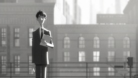
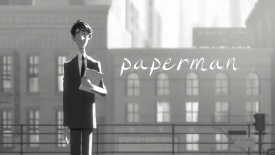
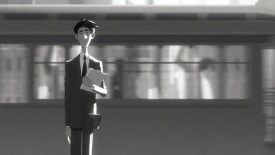
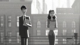
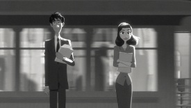
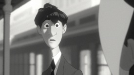
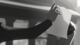
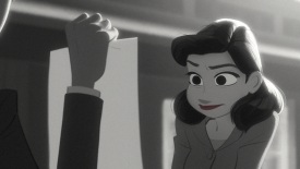
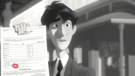
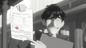
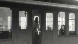
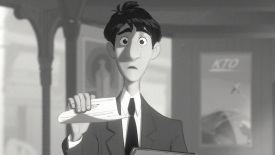
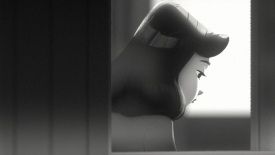
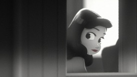
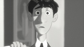
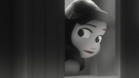
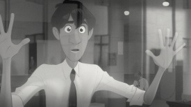
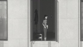
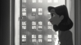
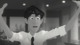
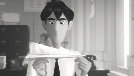
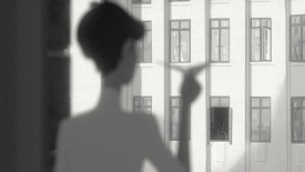
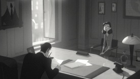
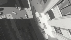
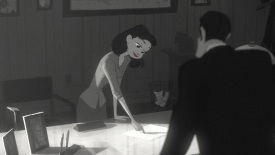
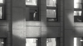
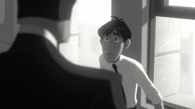
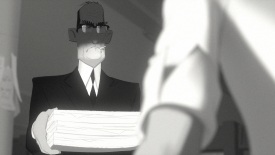
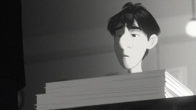
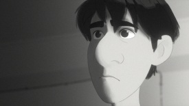
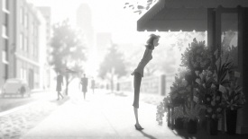
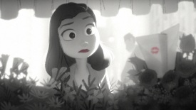
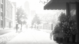
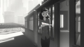
I saw a short film called “Paperman” back in 2012. It looked like it was 2d animation, but later when I read more about it, I discovered that it was actually more of a 2d/3d hybrid. It used a brand new software pioneered to take 3d animation and combine it with 2d line work. It went on to win the 2013 Academy Award for Best Animated short film. Just before Christmas I got a chance to talk to Jeff Turley who generously spent some time answering my questions about the film and his work as Production Designer.
How did you get involved in Paperman?
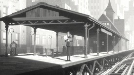
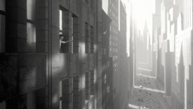
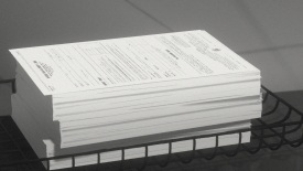
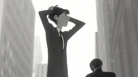
John Kahrs was the director of Paperman. He worked at Pixar for many years as an animator and had been developing Paperman off and on for about ten years. He started writing Paperman when he lived in New York City, it was inspired by his commute in and out of the city. Initially when he was thinking about the film it was going to be photorealistic. Back then when he was writing it, that was all the hype, photorealism. But he had a different way of seeing photorealism, he imagined it being a black and white photorealistic short film. So now jump forward ten years later, Patrick Osborne (the animation supervisor on Paperman) and I were playing around with 3d tools at Disney Animation Studio, and trying to do the opposite of photorealism. 3d software is inherently a very great management tool, as Patrick Osborne describes it; it’s super precise. We were trying to think of ways to break it and use it in a way that could bring illustrations to life. When we showed the test we developed called “Pet” to the studio during an event called spark, it was met with a standing ovation. Some didn’t quite know what they were looking at. One of the people in the crowd happened to be John Kahrs. John felt that maybe he could make his short in the stylistic approach we were playing with. So when it came time to pitch his short he asked us to come on board to make it and the rest is history.
So that’s how he pitched it to you? I have this idea for a short set in New York city but I want to do it with this creative style that you guys have come up with?
Yeah, exactly. He was like “It takes place in New York, it’s about this guy and this girl…” Actually initially it was about a man made of paper airplanes. Anyway, he pitched it and he said, this is a quote from him, “You guys are doing some hot shit!” I’d love to bring you on to help visualize the look. This was great news for me, because just months before this I was going through some personal things, and wasn’t feeling very well, and as a result received one of the worst performance reviews of my life. So this was sure to turn that around, hahah. This is the kind of jump start I needed. I had no production design or art direction experience and this was kind of my shot. So I said, let’s do it…actually I’m I said REALLY! In a sort of desperate way. Heheh. I mean we were already doing it for fun anyway so we might as well make it a real movie with these techniques. So began a sort of trio John Kahrs, Patrick Osborne, and myself locked in an office together for the next year or so making Paperman.
Well you couldn’t have come on to better first project as a production designer. An Oscar wining film is a pretty great way to start out!
Yeah, it was exciting. I never imagined it would win an Oscar. I had a feeling it would do well because the story was charming, and we had a lot of good reactions internally from the studio so I thought, yeah maybe this would be successful internally or within our small little animation community. But I NEVER did I imagine in my life it would do that well!
I feel like I read different places you were art director, and other places that you were production designer. What was your role on this and what were your responsibilities as far as the creative decisions go?
So Disney for the longest time called their production designers “art directors”. When Paperman was being developed that was the case. Since then they finally adopted a more industry title structure. So though I was listed as an art director, I was a production designer.
So you were in charge of the overall look of the film? Lighting, composition, camera angles, costume, character designs?
Exactly. But I had some help from very talented creatives of all disciplines. In animation, when working on shorts, you kind of wear a lot of hats as a production designer. You are a sort of cinematographer, art director, you could be a costume designer, character designer it really depends on how many people you are allowed to use. So a lot of times you’re doing more than you’d be asked to do on a feature film. I had many talented designers pitching in for the look so I wasn’t alone on this one.
Did you storyboard? Or did you come up with a lot of stuff on the fly?
I didn’t do any storyboarding, we have story artists who work with the director in the beginning. But I did have a lot of meetings to work out the camera’s and compositions. We would have a sort of workbook session with all the leads in a room, among them was Rasoul Azadani (layout lead) and we’d work out the lighting and camera in sequences. These sessions were intense. Lots of drawing with markers, charcoal, anything we could get our hands on to build the movie one composition at a time. So from the storyboards we would really start diving into more of the camera language and compositional aspects of the film.
Was it always going to be in black and white? Was there ever going to be any iteration where it was going to be in color?
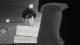
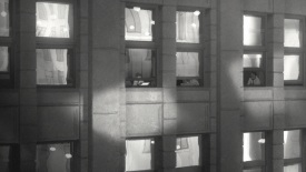
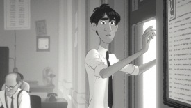
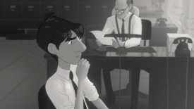
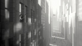
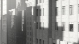
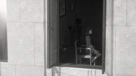
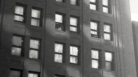
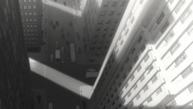
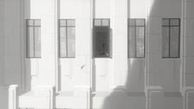
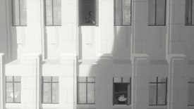
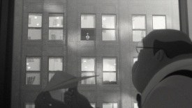
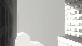
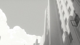
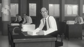
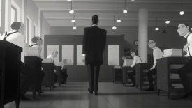
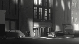
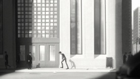
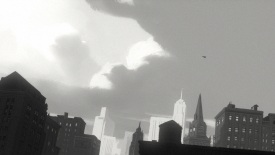
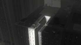
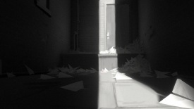
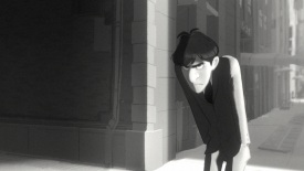
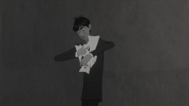
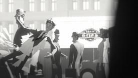
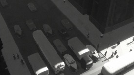
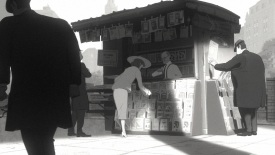
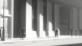
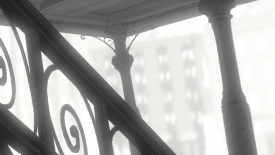
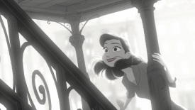
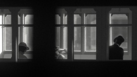
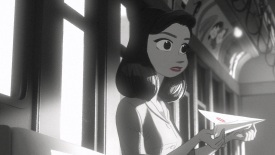
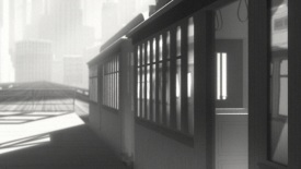
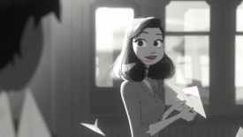
Always black and white. Ansel Adams was definitely on our list of influences, but the biggest one on my list was Bernice Abbot, a protege of Man Ray. She’s fantastic. What makes her special is that she was photographing New York city in all its truth; raw and gritty New York. She was really the first one to break out of this staged photography of New York in the 50’s. She wanted to capture New York in its most honest state. The kind of hustle and bustle and buzzing of the city. A good portion of her work takes place in York City. She’s a huge inspiration for us, her work is all over our film. Not a lot of people know about her, she’s one of those gems that you find and wonder why you haven’t seen her work before.
How much artist freedom did the artists have? I come from live action mostly where you don’t get to choose anything or make many creative choices. They say “here’s the shot, light the CG so it matches this” and that’s what you do. But in an animated film, how much freedom do the artists have?
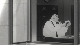
I tried to give the artists a lot of freedom on the film, but I think out of most of the movies I’ve production designed on, I was the most militant on this one. So I didn’t give as much freedom as I would have liked. I did a color script, or value script, of the entire film and that script was to be taken and handled very literally. For character design and costumes I gave more freedom, but when it came to lighting and shotmaking, I was very specific about the kind of shots that came through.
The aspect ratio. Do you know why 1.85:1 was chosen?
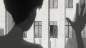
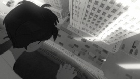
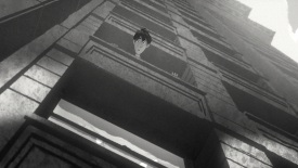
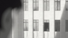
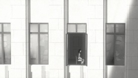
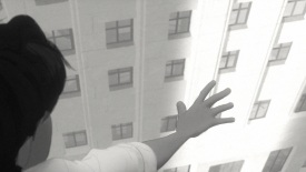
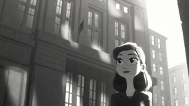
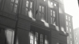
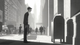
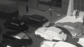
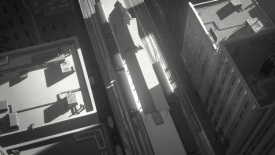
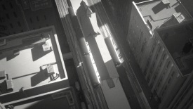
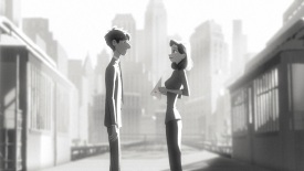
The best answer for that is that New York is very difficult to shoot because of the building heights, so if you’re using 2.39:1 it doesn’t really favor the city itself, but using 1:85 allowed us to have a little more vertical length to get some of those shots, even if we were going to shorten the lens. But we were still able to get those buildings in a really nice way. In my opinion buildings and the city itself were a kind of character in our film and if we can’t shoot them, it’s going to be hard to get the story across.
Talk about this software “Meander” that you and Patrick Osborne had been working with. Di you work on developing it? How did you use that software and what does it do?
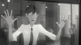
Patrick and I didn’t develop it. We were working with a developer named Brian Whited who went on to win an academy award for this tool. Basically he’s a genius who has a doctorate in line theory, didn’t even know that was a thing until I met him. Amazing. Before we brought him on he had already begun developing the architecture for this tool for “The Princess & The Frog to help move shadows around on 2d characters using a tracking aided technique. This way the Ink and Paint department can animate on 15’s and not 2’s. We started talking to him in a sort of advisory capacity and he explained that this tool he created called Meander would work nicely for what we were trying to do and that maybe he could retrofit it to work with our short and save us time. We like to think of him as our secret weapon. The best way to describe Meander is: imagine having an artist draw one design in one pose and draw another line in another pose 48 to 60 frames later, which is a significant amount, and the computer just knows how to move it from one place to another perfectly. That’s how magical it was. Now because we were using 3d we had way more information to make it even more accurate. Brian used 3d motion vector data to track and move the 2d lines in space. Yes, my mind’s fried too! Hehe.
So it uses the 3d model to help interpolate the 2d designs that you’ve done over a wider frame range?
Correct.
Sometimes when you start working with a new technology or software it great, it does stuff that’s never been done before but it also introduces problems that you’ve never encountered previously. Did this give you an additional challenges that you never faced before in traditional 2d or 3d work?
There were a lot of pains inherent with using it as it was being developed for our show. I think one of our lead animator’s Sarah Airriess said it best, “It’s so hard to work with, it takes so much concentration to use… I can’t even listen to music while I’m working”. So it was difficult to use at times, but luckily, Brian Whited was always working on it and going back to the artists and asking for feedback. He would have things turned around in a day. When the software had a bug a little notification would come up and say “Brian has failed you ” he had a sense of humor about it. So we took it in stride and had a fun time using it. In the end, it wasn’t too painful because we knew we were making something special.
This film was also released in 3d. While you were planning it did you have to make any special considerations for the way you were composing your shots for the 3d screening?
Yeah, we thought about that. John our director isn’t really a huge fan of 3d. But oddly, stereo works so well with the graphic style, it was this weird amalgam of realism and illustration that makes it fantastic to experience. So we embraced it as part of the medium, but we would have to recompose elements in the film like props and characters so they’d look better in stereo. But it was considered from the beginning. It wasn’t an afterthought.
Do you have a favorite shot in the film?
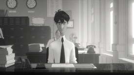
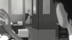
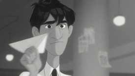
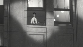
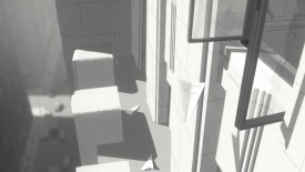
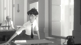
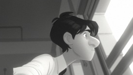
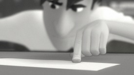
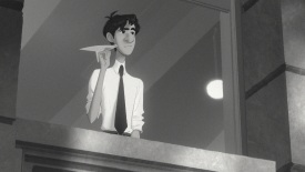
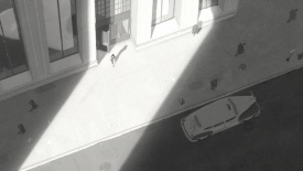
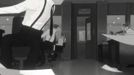
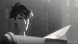
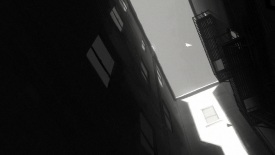
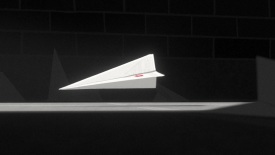
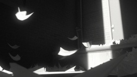
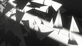
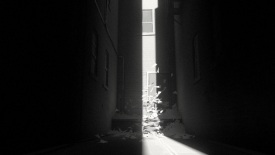
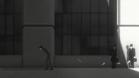
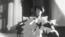
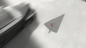
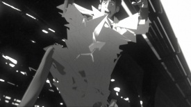
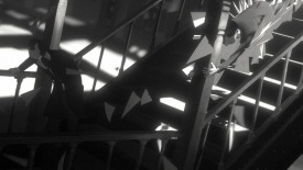
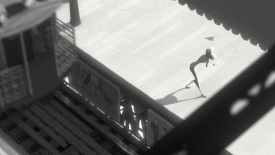
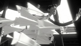
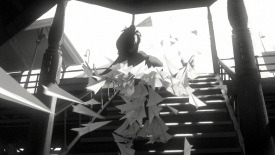
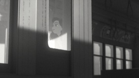
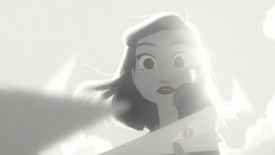
I do. My approach to the cinematography in Paperman was using light and shadow as a storytelling device. George is walking towards the light when things are good, and he walks into the shadow when things are bad. It’s a really simple idea I think people can get intuitively. There’s a shot I love where he is walking into a shadow and then the paper airplanes pull him out of the shadow and towards the light. And it’s just a striking delineator from shadow to light in the frame. You get this very strong shadow and this very strong overexposed light. I think that’s my favorite shot.
Were there any shots that didn’t come out quite as you were hoping? Or did “read” as well as you thought it might?
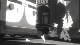
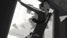
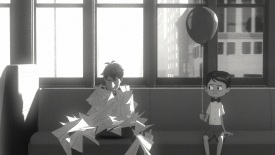
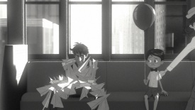
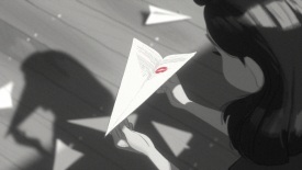
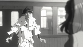
There are a few. I think the shot on the train where the paper airplanes are covering George. I think the paper airplanes looked a little “computery”. I think we did ok, but felt we could have done better. There’s plenty I feel we could have done better, but in the end we did alright. Most of it the audience wouldn’t even see. It’s our burden as filmmakers.
This might be a stretch, but have you seen the French film “The Red Balloon“?
I have.
Is that shot with George on the train where he is sitting next to the boy with the balloon an homage to “The Red Balloon”? Because both films have some very similar elements.
I wish I could say it was, but it wasn’t. I think it was coincidental. I think we just needed comedic relief at that moment, why not be a kid holding a balloon. John Kahrs being a film buff is certainly aware of that film, but I actually asked him before today just to get clarity on that, and he said he wasn’t thinking about that film for that shot, but he did say he appreciates The Red Balloon.
This is legitimately one of my favorite short animated films. It’s just so graphically pleasing. The lighting and composition and everything just seems to perfect. So what a great film to have on your resume.
Well thank you so much. I really appreciate that.
