Deconstructing Amelie
One of the biggest elements of the film that struck me was the visual style. I’m sure I had watched movies with distinctive visual style before. Movies by Tim Burton, Tony Scott, Wes Anderson, Michel Gondry and Terry Gilliam come immediately to mind. But Amélie was the first that made me sit up and take notice. Since then, I’ve watched all Jean-Pierre Jeunets other films and I think I can safely say that the visual style is consistant regardless of what cinematographer, production designer or art director Jeunet uses.
A few observations about Amélie.
Amélie was shot by Bruno Delbonnel on Kodak Vision 250D 5246 and Vision 320T 5277.
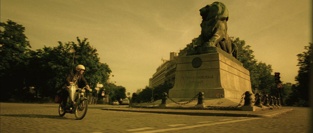
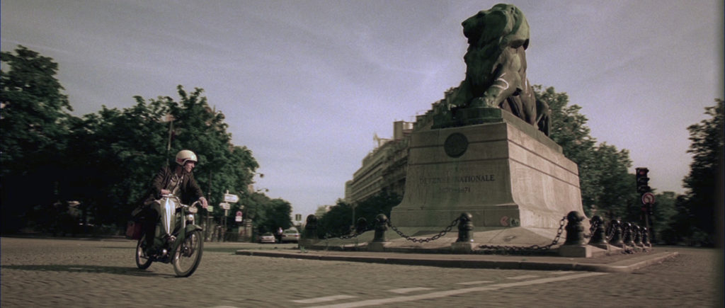
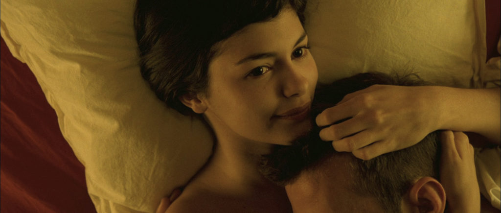
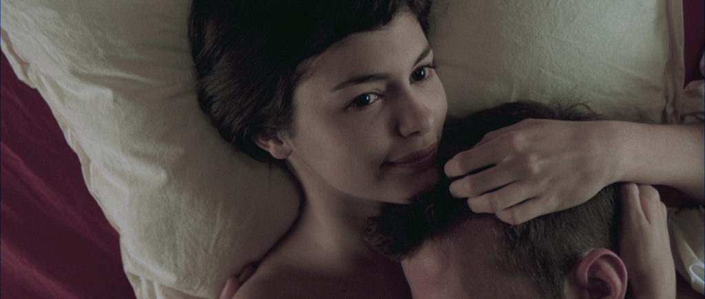
Amélie has a very specific color palette. It is a very warm film infused with reds and greens. The color blue is only prominent in only a few shots; so few in fact you can probably count them on one hand. Although much of the color of the film was a result of the DI process (graded by Didier le Foues using Discreet Lustre and supervised by Yvan Lucas) some of the daytime images were shot with a 81EF filter to add some warmth and color. Amélie is also a very well lit film. There are virtually no scenes with complete darkness.
Jeunet loves wide angle lenses and putting his characters very close to the camera. Amélie was shot almost entirely using 14, 18, 21, 25 and 27mm lenses. This creates very distorted facial features which works well with his use of actors with unusual features. Jeunet actually used different lenses for different actors doing tests ahead of time to see which lenses worked best for a particular actors facial features. For Tautou they found that the 25 or 27mm lens was just right. Anything longer or shorter didn’t look good. The camera in Amélie is seldom at eye level. It is usually a bit above or below eye level. Combined with the wide angle lenses, a slight tilt up or down can lead to a very dramatic look.
The use of wide lenses also accomplishes two other things in the film. It creates a very deep depth of field where everything is in focus. I don’t blame him. If I had sets as beautiful and well designed as he does, I’d want them to be in focus all the time too. Basically having everything in focus allows you to have a better composed shot from a graphic point of view. The other thing this accomplishes, is that when the camera is moved the movement is that much more dramatic because the wide lens heightens the three dimensional quality of the camera moves. And Jeunet moves the camera a lot. Even just for simple push ins. Next time you watch Amélie try to count how many straight push ins there are on characters. Lots and lots. Notice also that when Jeunet dollies the camera he doesn’t pan it at the same time. Dolly shots for Jeunet are almost always very strictly locked off. Jeunet has said in interviews that this is why he does not like to use a steadicam too much because it makes it too difficult for him to maintain the kind of strict consistency that he is looking for.
Check out a few images from Amélie. Also notice how they look if you remove some of the warmth doing a kind of white balance. The first pictures are the original images from the movie. The second ones are corrected to be more realistically color balanced.
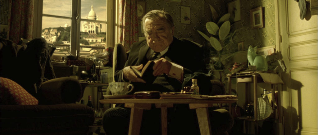
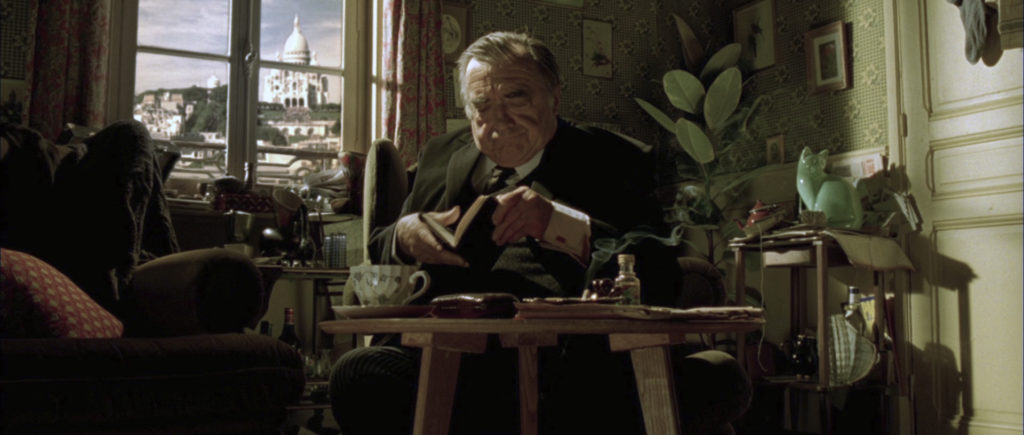
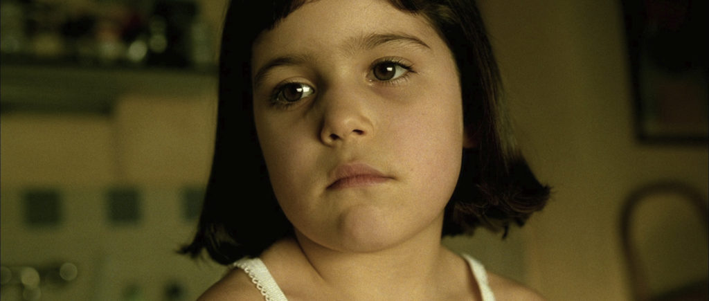
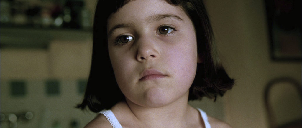
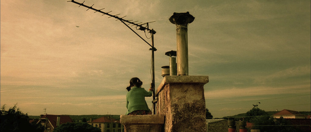
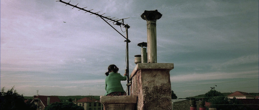
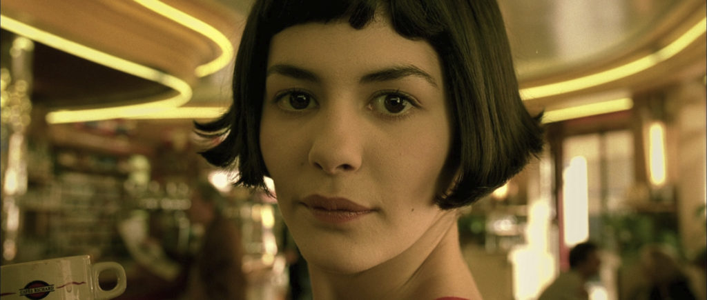
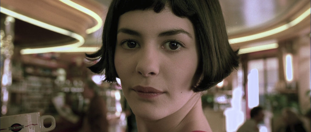
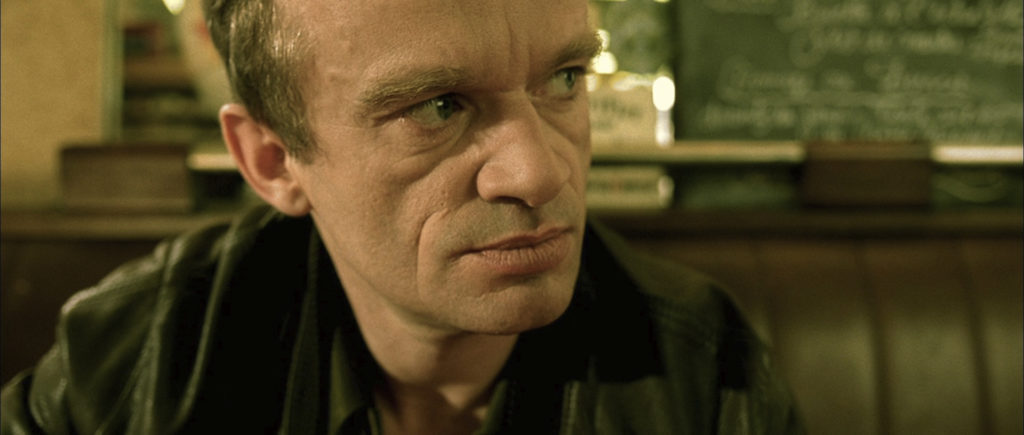
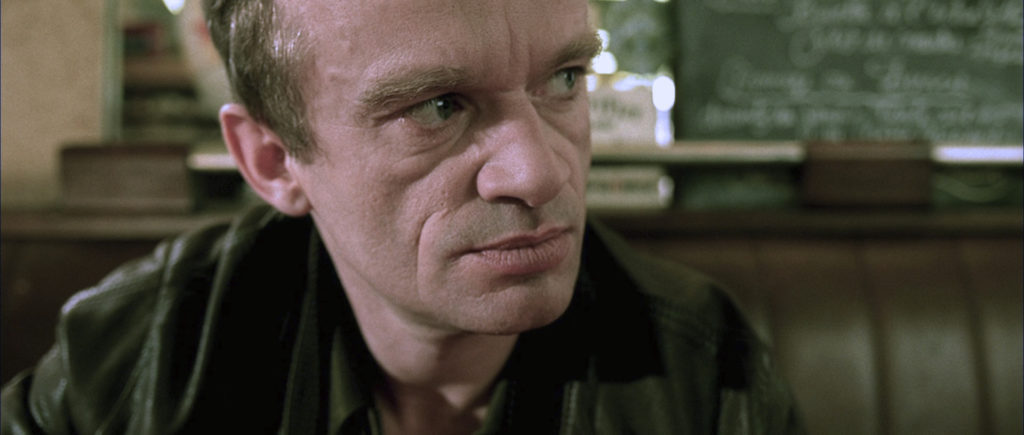
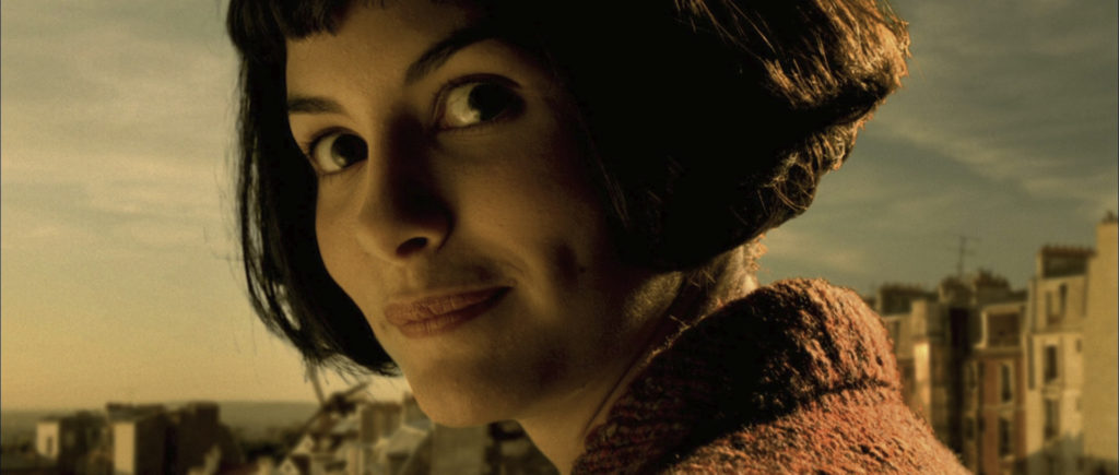
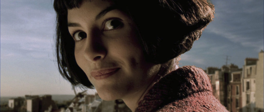
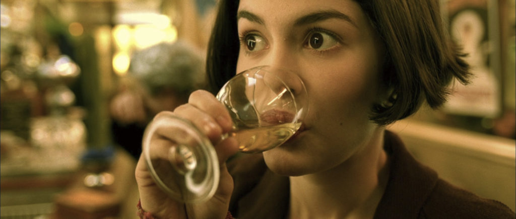
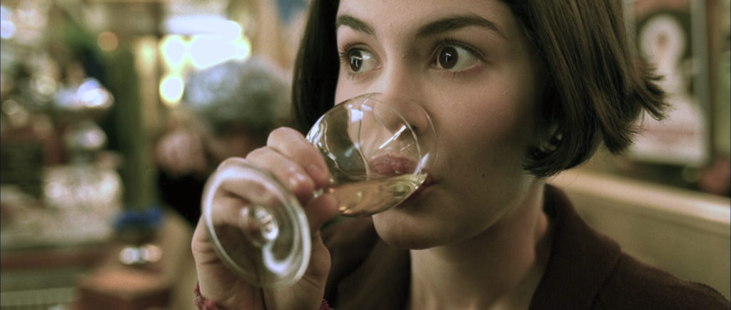
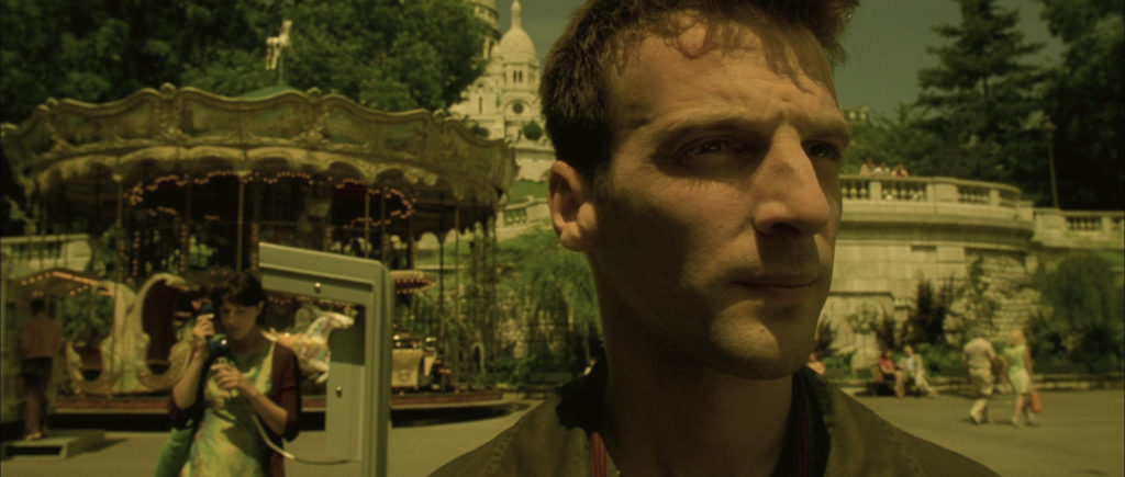
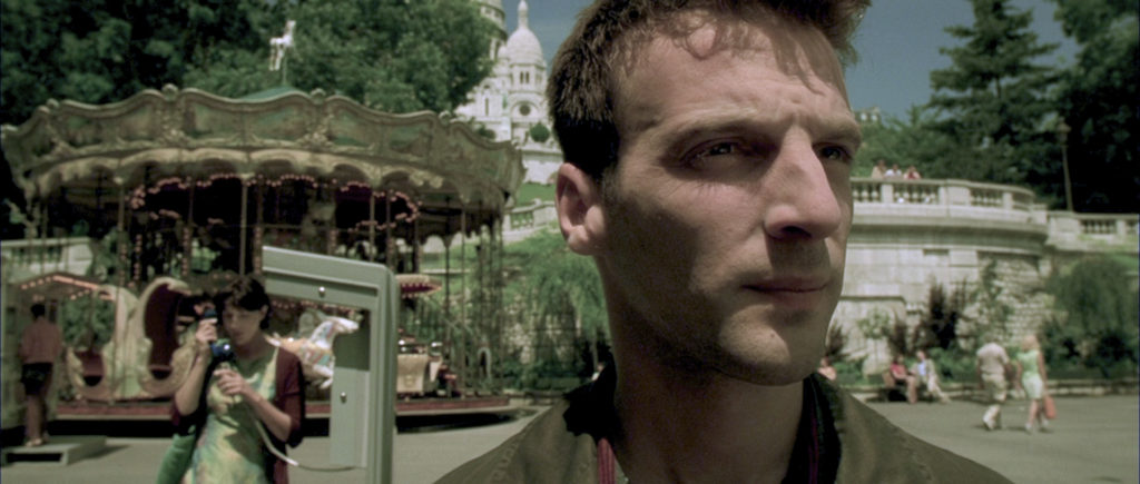
It struck me as I looked at some of the uncorrected images how much they looked like they had been shot with the old technicolor two-strip process since the reds and greens where to prominent and the blues were all but nonexistent. I wondered if I took a film that had not been corrected made it look like it had been given the technicolor two-strip process and then added a warm orange filter if I would be able to approximate the colors of Amélie. So I took some frames from “The Untouchables” (just a random movie I happened to have on hand) added a two-strip filter and then ramped up the warmth. First picture is the original. Second picture is the technicolor two strip process. Third image is the two stip photo that has been warmed up. This is how it looks:
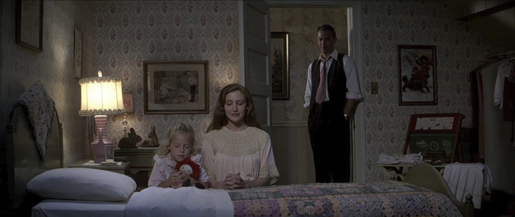
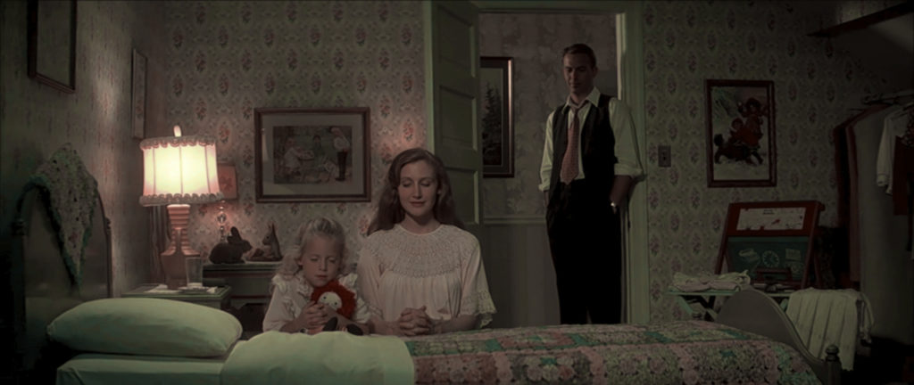
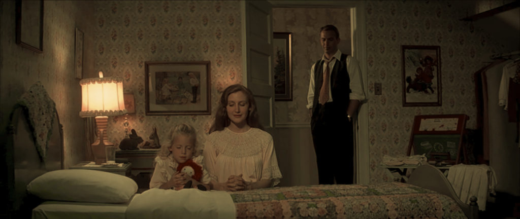
Another Example:
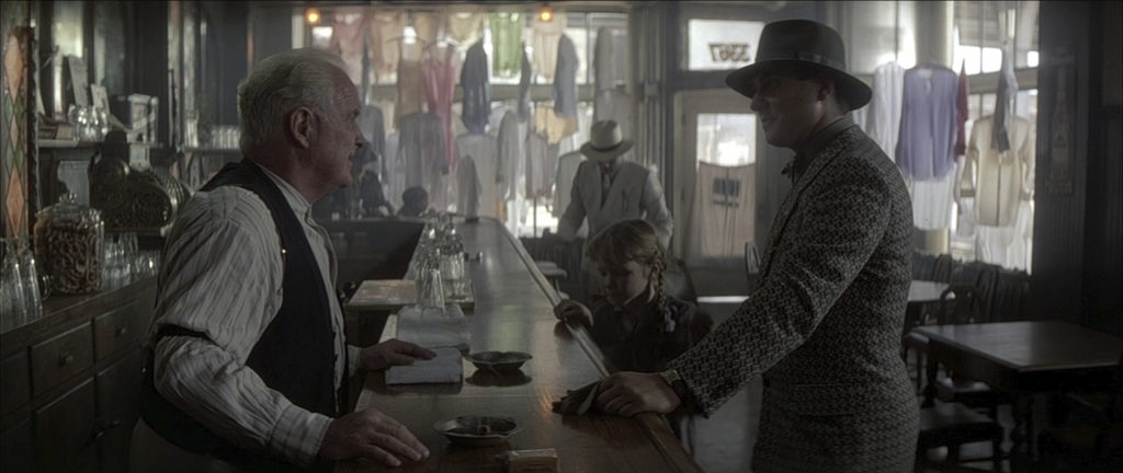
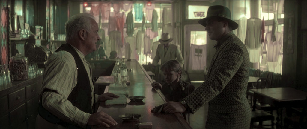
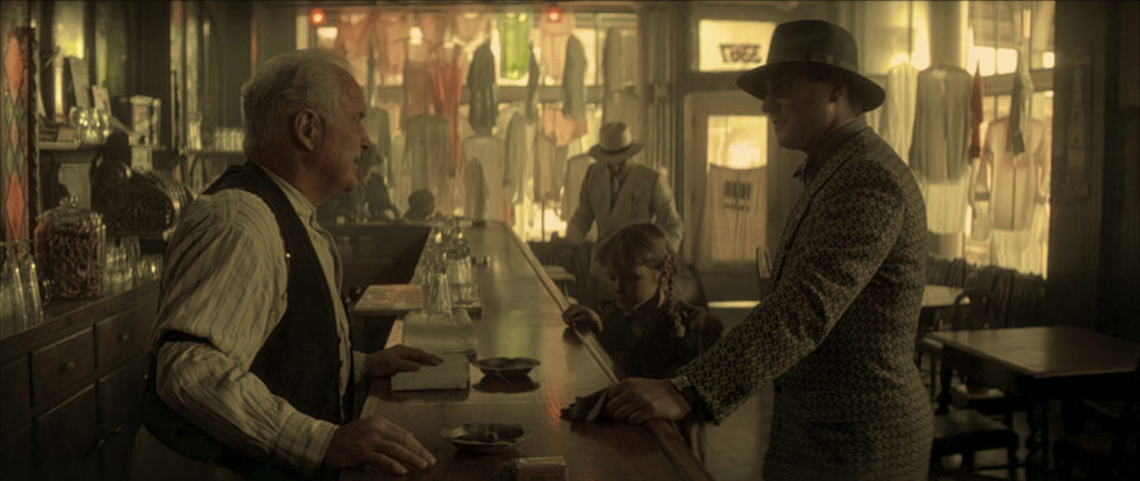
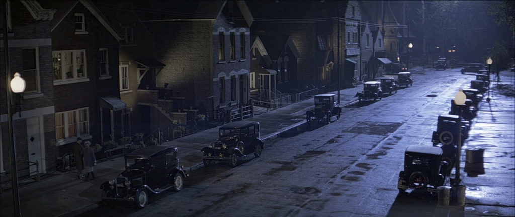
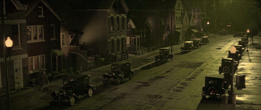
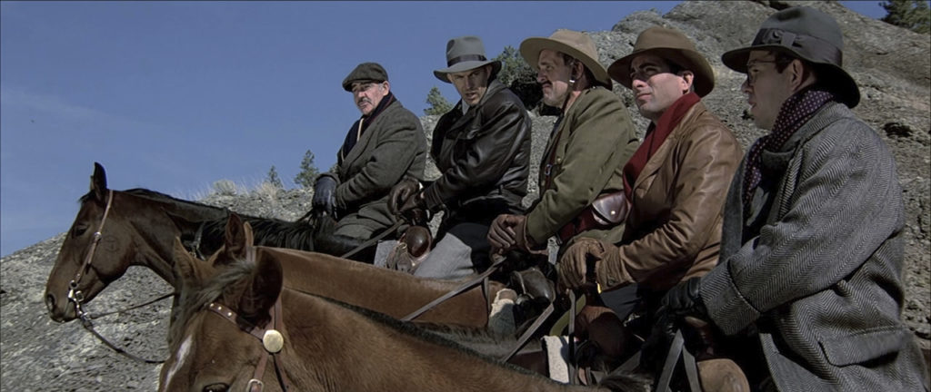
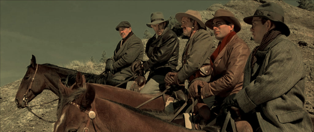
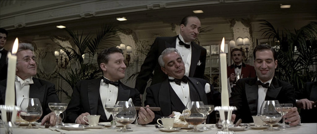
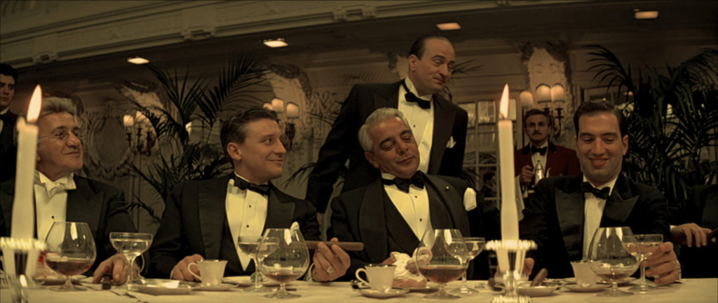
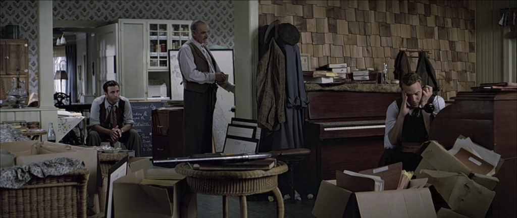
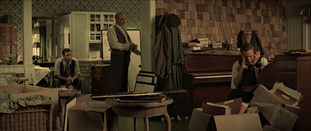
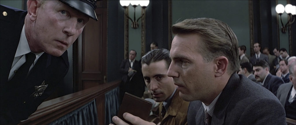
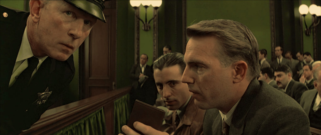
Obviously this process isn’t perfect but if you were looking to grade your movie to look more like Amélie, this gives you a good place to start. Also “The Untouchables” is pretty desaturated to to begin with so maybe I should have picked a different film to test my process out on, but if you were to apply this process to your own footage I think you would get very satisfactory results. If you try it out please post some images or a link I’d love to see how this works for you.
21 Responses
i agree totally about the distinctive color tones of “amelie.” jeunet seems to use it in all his films, though i haven’t seen them. screencaps of “a very long engagement” and “micmacs” are much the same. as much as i love the set design in “amelie,” i find the warm color palette – especially her hot red apartment to somewhat taxing to the eyes. whenever i make a visual presentation i design a background with a blue base: aqua, teal, lavendar. anything that allows the viewer’s eye to stay focused on the product being featured. i hate when a hardcore novice picks a template with a yellow-based red in it and expects people to be able to look at that for any period of time.
another film that uses this greenish tone is “harry potter & the half-blood prince.” it is the only movie in that series to go this route, so it really stands out.
Its funny you should mention “Half-Blood Prince” since that was also shot by Bruno Delbonnel.
well, there you go
Really nice study, thanks for that !
wonderful post, well done, Amélie is also one of my favorite films but I never really took much notice of the color palette, very interesting
Awesome, thank you so much for this study. I’m a photographer looking to shoot a series of photos in the Amelie-style, this was really helpful. What exactly do you mean by the 2-strip process though? Right now I’d put my money on just converting all blues to slightly different tints, increasing the saturation of reds and greens and upping the white balance. Any additional tips would be much appreciated! If you like I could show some results when I’m satisfied with them.
The two-strip process is another name for Kinemacolor. Check out the first third of “The Aviator” It’s a great example of what the process looks like. In the end, some color processing can help a lot to achieve the look, but a majority of the look comes from carefully chosen color schemes in the production design, sets, costumes etc.
I’d love to see your photos when you are finished with them. Best of luck!
wonderfull post, Amelie is also one of my very favorite movie. realy very nice study about color, set design, and camera work..
Is dolly only what they use? There seems to be plenty of jib/crane kind of shots.
Watch Amelie again. Everything you wrote is true but I think you missed something. In the beginning the main colours are red and green. Every time a major plot point occurs a new colour is added to the film’s palette. Orange is introduced after she helps the blind man. Blue is introduced with the arrows drawn on the ground. As Amelie’s world expands and grows so do the amount of colours. The red and green (being complimentary colours) are a different take on her life being black and white. By the end she’s living in full technicolor.
This is an awsome article.
I would love to know where I can find information about Didier Le Fouest. if anyone knows.
http://www.didierlefouest.com/
Hi, thanks for the article it’s really helpful. I’m currently writing a dissertation on Amelie for my degree and i was wondering if you could please share the source you used for the bit about different lenses being used specifically for each actor? thanks!
Hello, could you share the filter or LUT 2 strip Technicolor that you used for this test?
thank you beforehand
Roman
I believe I used the Tiffen Dfx Digital Filter Suite.
If you google around you can find some free ones though.
just a quick comment to show my appreciation for this post; absolutely love Amelie and this post helped me to get a bigger insight into the film making process- at first I thought my colour balance on my monitor had changed!
So, how many shots it has? Maybe I counted wrong but it’s up to 1260 shots.
It’s between 1300 and 1400 I believe. Don’t know the exact number.
Hey,
I only just found your website when I was looking for articles about the colour grading of Amelie. I’m a freelance colourist so I’m always on the look out for good articles. Your article was great, very informative and interesting. I looked at your VFX reel, really great work. Looking forward to diving deeper into your website.
Keep up the good work
Drew
Hi, this is fascinating and I appreciate it. In your Untouchables test, where did you find the two-strip process filter?
I don’t exactly remember what I used. It was a long time ago at this point, and the plugin probably doesn’t exist anymore, but BorisFX has a suite of tools called Continuum that includes a plugin called BCC+ Two Strip and it does this.